How to Identify Bitcoin Breakouts, Fakeouts, and Trends
Updated: Jul 21, 2020 at 20:04

The blockchain and cryptocurrency community is composed of many different kinds of participants, both newbies and veterans, and all of them want to learn how to identify trends in crypto charts, and ascertain breakouts and fakeouts while trading digital currencies including Bitcoin, particularly for margin trading.
Breakouts have a tendency of occurring after times of abridged and lower volatility towards the end of trends, and normally indicate a trajectory reversal effort by participants in the market and other significant contributors in the industry. A break can also signal that the crypto price is trending in the course of the break. However, in some instances, a breakout defies anticipations and hence turn out to be more of a fakeout.
BTC/USD 60m Chart
As we can see, Bitcoin is changing hands in a downward pattern making lower lows and lower highs. Basing on this very chart trend, the topmost line is known as the “major trendline,” and the bottommost line is known as the “channel line.”
Most breakout traders normally seek for two main signals during the downward trajectory of the cryptocurrency: a support formation that is just overhead the channel line and the high volume breakout of the upward movement of cryptocurrency prices.
The volume profile of BTC/USD is uniformly falling in this particular downhill channel as whales and bears get bushed. Towards the far end of the channel, it is clear that Bitcoin found support at around $9400 and this means that the bears lack the impetus to influence the price of Bitcoin back bottom to touch the channel line. The whales see an opportunity to exploit the bears’ delicacy and frailty of with a weighty volume trend to the upward price which hits and perforates the major trendline.
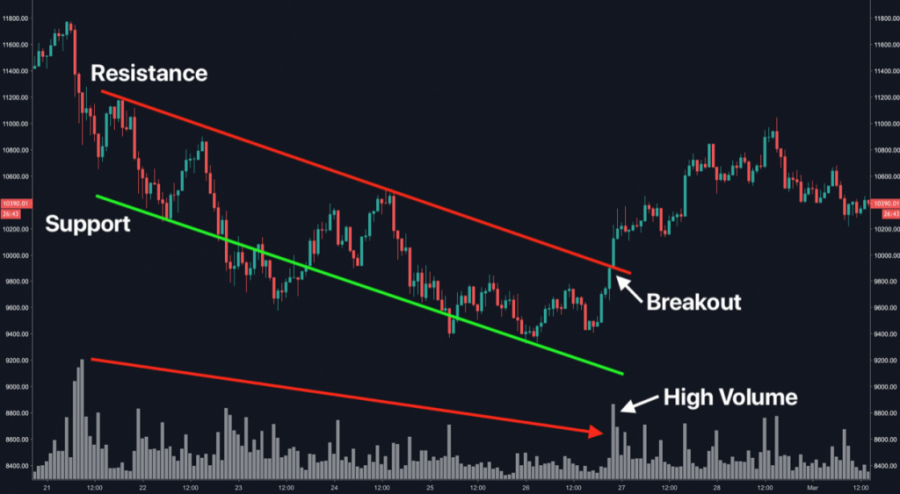
If you see clearly, you will observe that a fakeout was experienced – it is that area where a fake breakout was not supported by lofty trading volume. Following the pattern where Bitcoin was testing the channel line many times, it is clear that the cryptocurrency then dropped past the support level on Feb 23. A few hours later, the channel appeared to be in a short-term resistance.
Market Phases
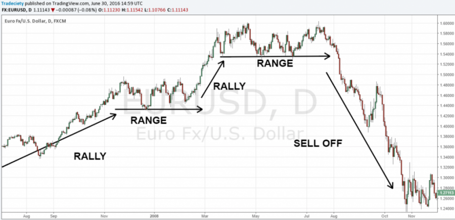
The graph below indicates three possible cases and how the cryptocurrency market keeps varying between different phases: Rally; Range; and Sell off.
Crypto markets can do one of three things: increase, decrease, or move sideways.
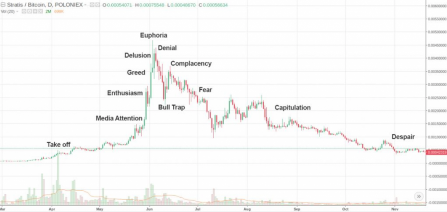
Bitcoin’s Mania Parabolic

Recurring Market Chart
The Line Graph
This is the simplest way of reading trends, it is a simple and very operative tool that allows participants to have a look at the entire mess and noise happening in the market. The bars and candles offer detailed data concerning what is taking place on the charts. Crypto traders should zoom out to see the line graph very clearer to properly understand what is taking place in the market.
Moving Average Convergence Divergence (MACD)
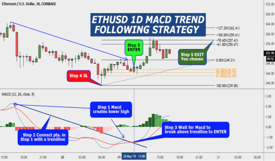
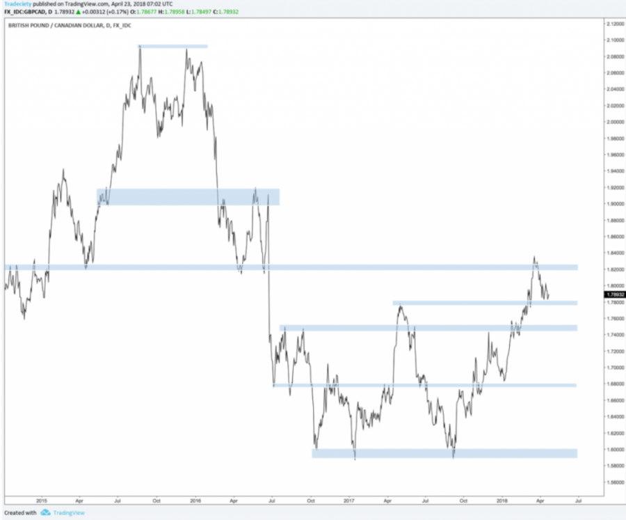
The Market Rhythm: Highs and Lows
This is a simple way to analyze cryptocurrency charts, it lets you clearly know any prices quickly.
The conventional technical analysis indicates that when there is an upward trend in prices, higher highs is registered since the buyers take the bigger share and lows are also lofty since buyers frequently make a purchase following the fall in price in time. Furthermore, the lows are also lower at the time when the seller’s surplus pushes the price down, and highs are lesser due to the fact that sellers sell of the crypto earlier enough and the purchasers are not willing to buy again (less interested).
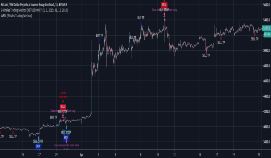
Using Moving Averages (MA)
These are among the most used trading tools in the market and they also make it easy for traders and buyers to ascertain market trends. But, participants should know the following things when using moving averages: the length of MA extremely influences when there is a clear signal that markets will turn; a fast MA tend to provide fake signals since it quickly reacts to minor price trends; and a slow (big) MA might as well give signals belatedly.
If you look at the 50 EMA (mid-term average) below, you will see that during the upward movement, the price was above the MA and the moment price crossed the MA, it automatically moved into a range.
Traders can use moving averages as a filter too, by looking for trades in the course of the day-to-day moving average specifically on the lower period of time.
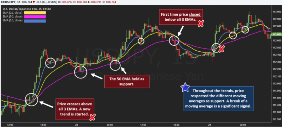
The 50 MA is the more standard thump-trading MA and most widespread. Most cryptocurrency traders use it to drive patterns due to the fact that it’s the perfect concession between shorter and longer period.
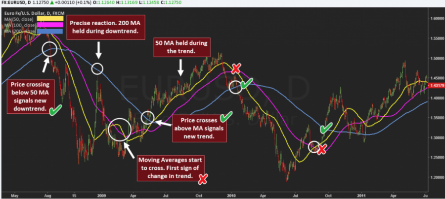
Using ADX Indicator
The ADX can be used to identify both the direction and strength of the price trajectory. The ADX indicator has 3 main lines, which are: the ADX line which shows the strength of the trajectory (it is not provided in the chart below); the +DI line that indicates the upbeat (strong) strength – always a green line; and –DI line that demonstrates the bearish (poor) strength – normally a red line.
When you take a close look at the chart provided below, you will see that the ADX shows an upward trend when the “green line” is over the “red line,’ and further shows a downside when the red line is above the green line. During the period when the crypto price is ranging, the green and red line become close to each other and float in the middle area. The ADX can also be used alongside the moving averages, as we can see, when the DI lines cross, the crypto price crosses the MA too.
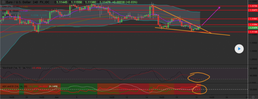
DI stands for Directional Index and ADX is Average Directional Movement Index. EURUSD on the fairly time frame is showing a bullish breakout. Besides that the Stoch Rsi has almost made a bullish crossover and on the ADX we see a bullish claw (red line spark bend down, green line sharp bend up) which is an early bullish reversal sign. Buy with a target of at least 1.1240. a nice place for a stop would be at 1.1090.
Source text: https://it.coinidol.com/come-identificare-breakout/
Coin expert
News
Price
News
Price

(0 comments)